A human-centered brand, built for new experiences.
Lil Horse rebranded URBANDER, connecting brand strategy with a visual identity applied across web, social media, collateral, motion, and an immersive metaverse experience.
Services & expertise
Brand Strategy
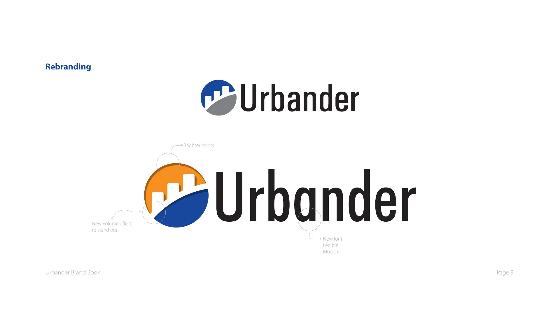
Rebranding
Web Development
Social Media Design
Collateral Design
Custom Illustration
Icon Design
Motion Graphics
Metaverse
The client
URBANDER.
URBANDER is a solution-driven agency that helps transform businesses to advance humanity. Its work brings a human perspective to the way organizations communicate, connect, and grow.
The opportunity
Where we started.
URBANDER came to Lil Horse for an aesthetic brand update. The collaboration revealed a broader opportunity: express the ideas already clear to its leadership, sharpen the strategic concept, and create a brand that communicates with greater clarity and emotion.
Our approach
Start with purpose. Give it a visual language.
We began with a creative session to understand the team’s expectations and ideas. Research and a brand audit then identified opportunities in visual expression and communication, captured in a findings report and insights panel.
From there, we defined the brand’s strategic pillars, archetype, and ideal buyer. We translated that foundation into a refreshed logo, color palette, typography, photographic direction, graphic elements, and applications. Custom icons, illustrations, animations, and motion graphics expanded the system across different formats.
Brand research, audit, strategic concept, archetype, and ideal buyer.
Rebranding, logo development, typography, color, and photographic direction.
Custom brand icons, illustrations, animations, and motion graphics.
Brand application across the website, social media, and collateral material.
Extension of the brand into an immersive metaverse experience.
01 / Brand foundations
A clearer expression of the business.
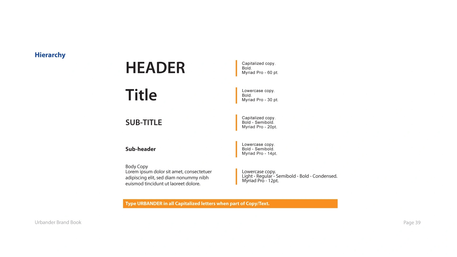
A refreshed identity and a defined typographic hierarchy give the brand a recognizable, consistent foundation.
02 / Visual language
A brand with its own dimension.
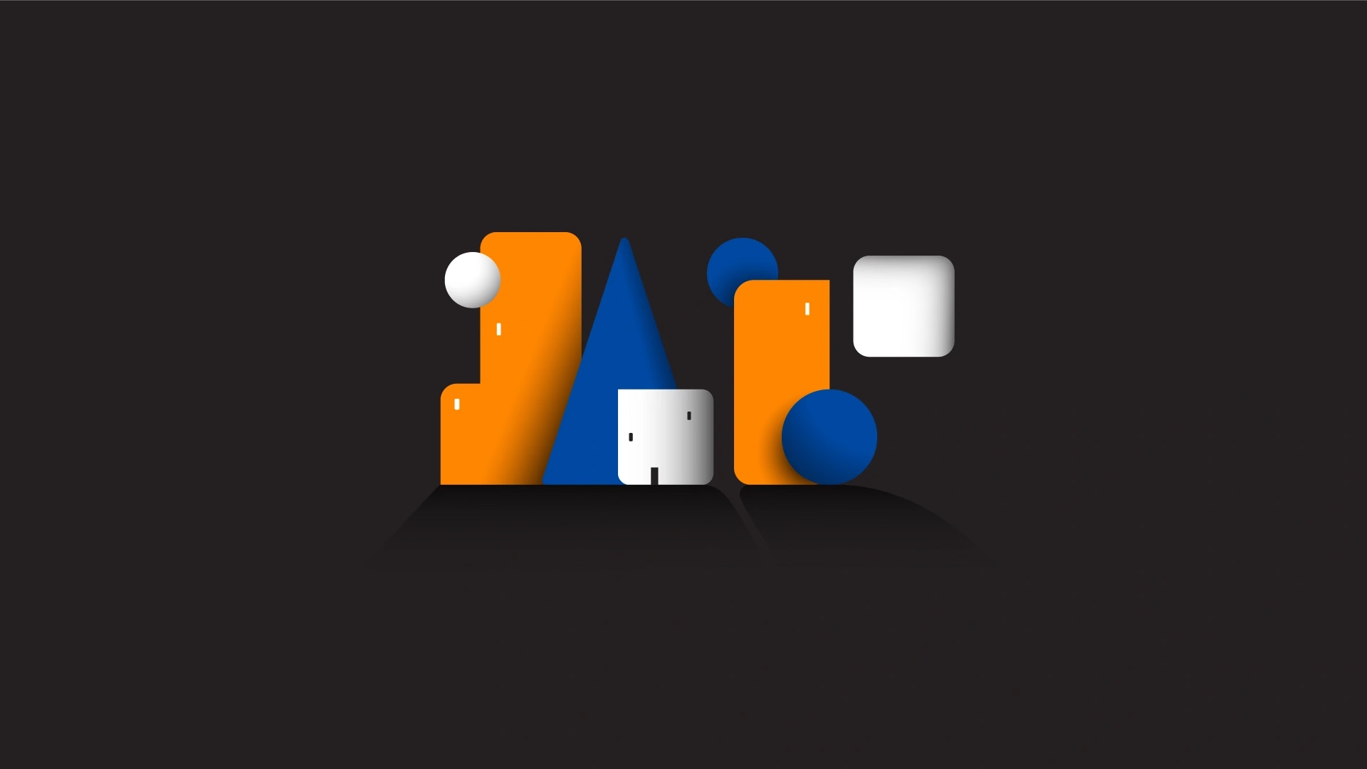
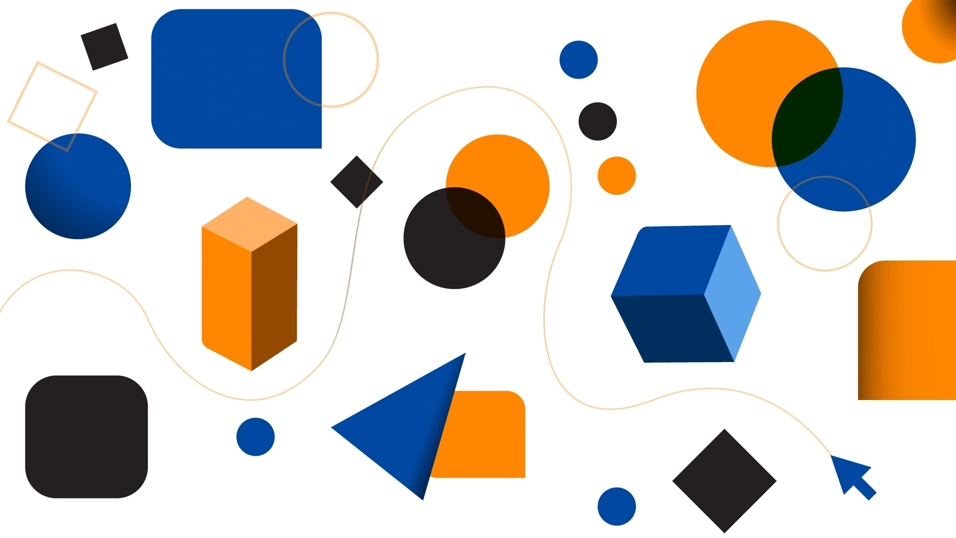
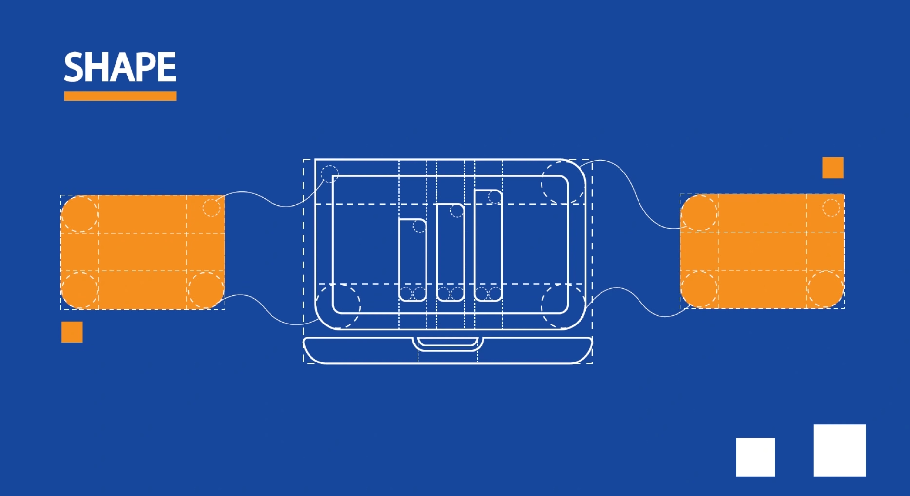
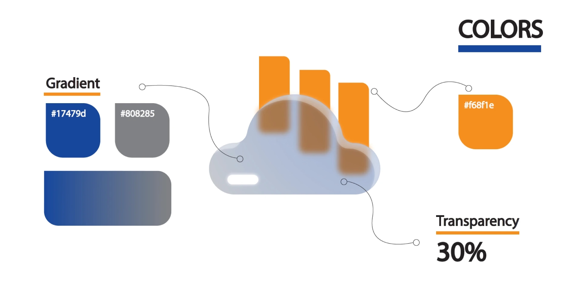
Geometric forms, a distinctive palette, and dimensional artwork give URBANDER a flexible visual vocabulary.
03 / Brand illustration
Human stories. A recognizable style.
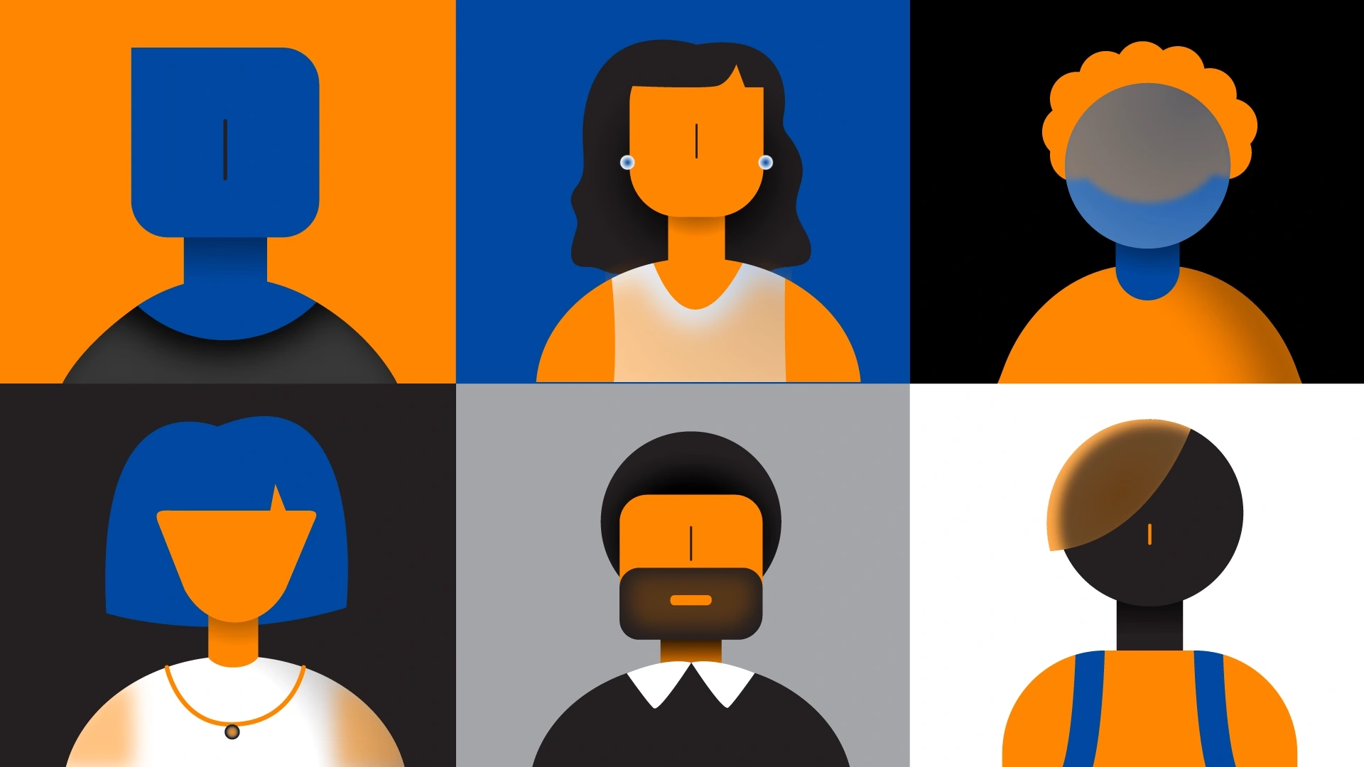
Custom characters and scenes translate the brand’s human-centered purpose into a visual style of its own.
04 / Custom iconography
Small details. One visual system.
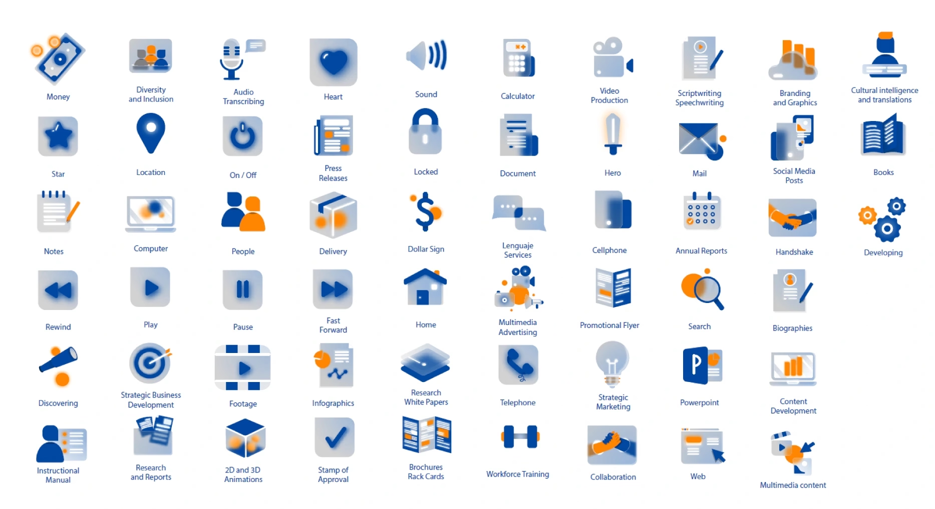
Shared geometry and color connect a family of icons across communication, collaboration, and digital services.
05 / Brand applications
One identity. Many ways to show up.
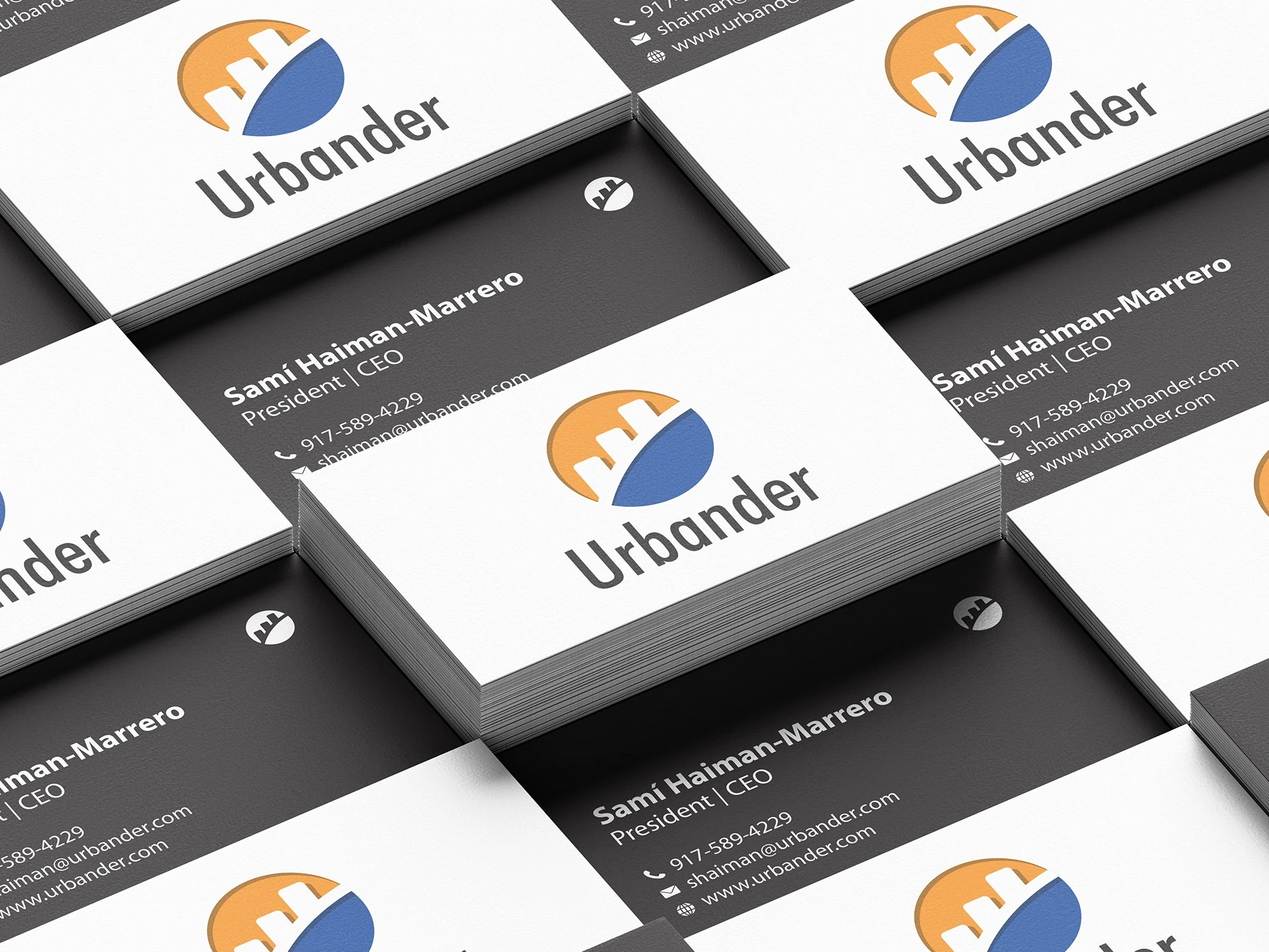
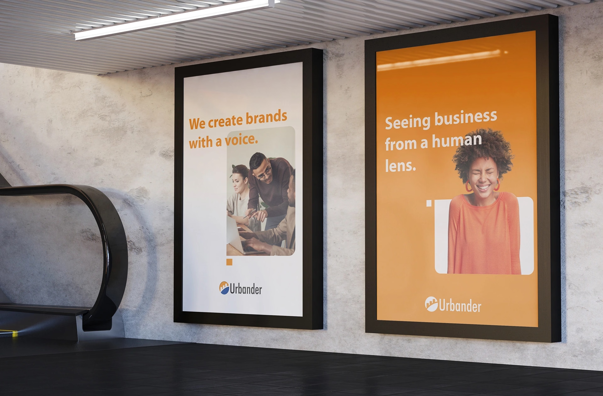
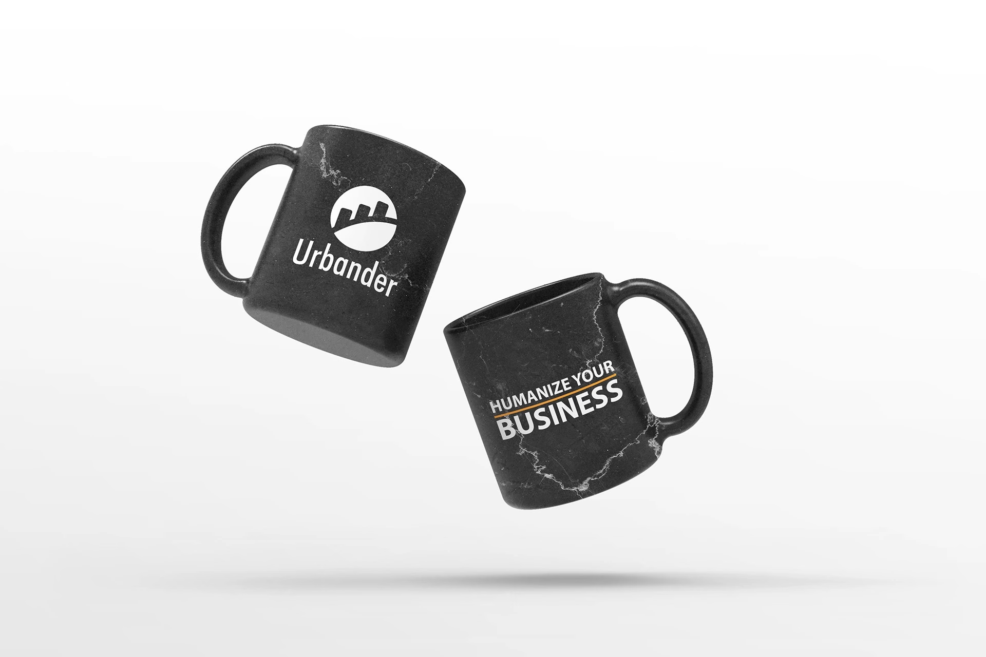
The refreshed identity carries through collateral, stationery, campaign artwork, branded objects, and environmental applications.
The outcome
Human purpose. A more expressive brand.
Strategy made visible
The brand’s purpose, personality, and audience translated into a distinctive visual system.
Built to extend
A coordinated toolkit for web, social media, collateral, illustration, and motion.